

Unpause + Experimenting with events similarity
Unpause + Experimenting with events similarity

Are you still around? How have you been? How's your family doing?
That's great to hear! :)
As for me, you know how it goes. Life takes over and things fall through the cracks. But the discursus project has been making steady progress (check out my Medium channel for some light data engineering reads). However, for some reason, I felt a bit intimidated about writing here again.
But I really want to. I just need to keep it light and fun. So let's unpause this and explore some protest movements.
Cheers!
In this post, I’m exploring ways to assemble protest events based on the similarity of their descriptions.
In the project’s schema, there is a movement entity that is used to group protest events together. But it’s driven by a set of text-based rules. For example, Gender Identity protest events are grouped together when the following regular expressions are found in their descriptions:
.*transgender.*, .*drag queen.*, .*lgbt.*, .*pride flag.*, .*lqbtq.*, .*gender.*, .*anti-trans.*, .*drag show.*Not great!

In this Hex notebook (wish I could embed those in Substack), I explore ways to group events dynamically. Let’s go through it.
I start by grabbing the articles that covered protest events in the last 28 days.
select distinct
    s_observations."observationUrl",
    s_observations."observationPageTitle",
    s_observations."observationPageDescription"

from "Event" AS s_events
join "Observation" as s_observations
    on s_events."__cubeJoinField" = s_observations."__cubeJoinField"

where s_events."eventDate" > (NOW() - INTERVAL '28 days')
Which returns 77 rows. Let's ask OpenAI for a summary of those events.
import openai
openai.api_key = openai_key

def get_completion(prompt, engine="text-davinci-003", max_tokens=128, temperature=0.5, top_p=1.0, frequency_penalty=0.0, presence_penalty=0.0):
    response = openai.Completion.create(
        engine=engine,
        prompt=prompt,
        max_tokens=max_tokens,
        temperature=temperature,
        top_p=top_p,
        frequency_penalty=frequency_penalty,
        presence_penalty=presence_penalty
    )
    return response.choices[0].text

my_prompt = f"Please provide a summary of the top 15 protest events from the following descriptions using markdown bullet points. Limit each bullet point to 100 characters including spaces and punctuation. Here are the article descriptions:\n{combined_text}."

completion_protest_summary = get_completion(
    prompt = my_prompt,
    max_tokens = 1000
Here’s a sample of what it returns:
A Crowd of Protestors Gathered at a New York City Courthouse for the Filming of 'Joker'
Students Speak Out Against Illinois High School Threatening to Discipline Students Who Protest
The "Trans Day of Vengeance" Protests Planned by the Transgender Radical Activist Network
Outraged Denver Students and Parents Demand Better School Security and Push for Tighter Firearm Laws
President Criticizes Drag Shows Stereotyping Women for Amusement of Audience
Police Station in Minneapolis Set Alight During Third Night of Protests Over Death of George Floyd
With this summary of the main protest events that occurred in the past 28 days, let’s start exploring similarities between them.
I start by calculating the similarity between those events and plotting a heatmap of the similarity matrix.
# Calculate the cosine similarity between the document vectors:
similarity_matrix = cosine_similarity(document_vectors)
print(similarity_matrix)
import textwrap
# Wrap the event_texts
wrapped_event_texts = ['\n'.join(textwrap.wrap(text, width=100)) for text in event_texts]
# Customize the plot size
plt.figure(figsize=(12, 12))
# Create a heatmap using seaborn
sns.heatmap(similarity_matrix, annot=False, cmap="YlGnBu", linewidths=.5, xticklabels=wrapped_event_texts, yticklabels=wrapped_event_texts)
# Add plot title and labels
plt.title("Event Similarity Heatmap")
plt.xlabel("Events")
plt.ylabel("Events")
# Rotate x-axis labels for better readability and set color to white
plt.xticks(rotation=90, color='black', fontsize=10)
# Set y-axis labels color to white
plt.yticks(color='black', fontsize=10)
# Show the plot
plt.show()Let’s first visualize a matrix that maps out how events relate to one another.
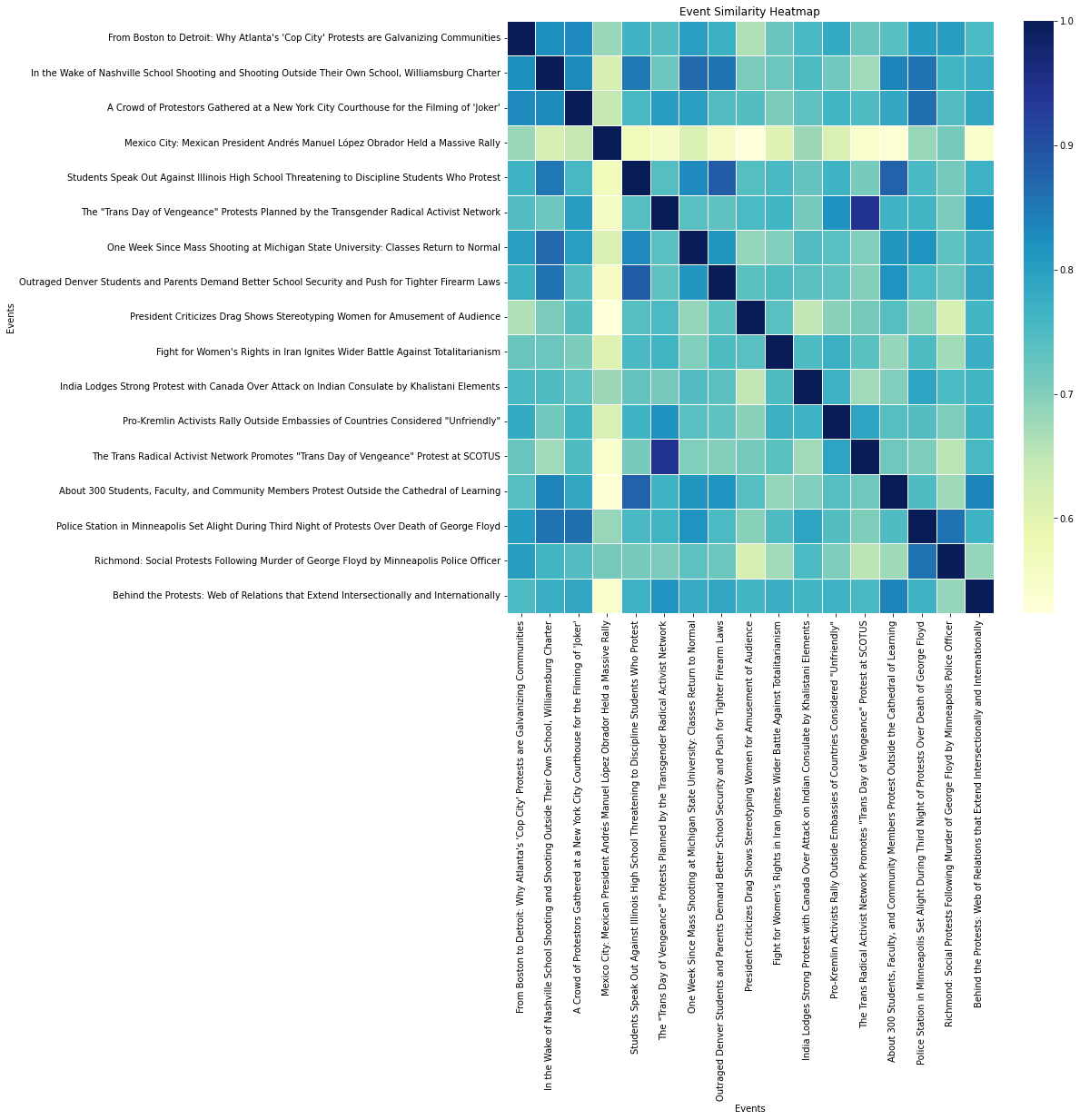
Interesting, but not great. For one thing, we want to see how multiple events relate to one another. Maybe clustering them together would make more sense.
import numpy as np
import matplotlib.pyplot as plt
from sklearn.cluster import KMeans
from sklearn.manifold import TSNE
from adjustText import adjust_text

# Wrap the event_texts
wrapped_event_texts = ['\n'.join(textwrap.wrap(text, width=50)) for text in event_texts]

# Apply t-SNE for dimensionality reduction
tsne = TSNE(n_components=2, random_state=42, perplexity=10, init='pca', learning_rate='auto')
embedding = tsne.fit_transform(similarity_matrix)

# Determine the optimal number of clusters
n_clusters = 4

# Perform K-means clustering
kmeans = KMeans(n_clusters=n_clusters, random_state=42)
labels = kmeans.fit_predict(embedding)

# Customize the plot size
plt.figure(figsize=(15, 15))

# Define cluster colors
cluster_colors = plt.cm.get_cmap('tab10', n_clusters)

# Create a scatter plot with different colors for each cluster
for i in range(n_clusters):
    cluster_points = embedding[labels == i]
    plt.scatter(cluster_points[:, 0], cluster_points[:, 1], color=cluster_colors(i), label=f'Cluster {i+1}')

# Add plot title and labels
plt.title("Event Clusters")
plt.xlabel("t-SNE 1")
plt.ylabel("t-SNE 2")

# Add a legend
plt.legend()

# Add labels to the points and adjust their positions to minimize overlaps, set text color to match the dot color
texts = []
for i, text in enumerate(wrapped_event_texts):
    label_color = cluster_colors(labels[i])
    texts.append(plt.text(embedding[i, 0], embedding[i, 1], text, fontsize=10, color=label_color))

adjust_text(texts, arrowprops=dict(arrowstyle='-', color='gray', lw=0.5))

# Show the plot
plt.show()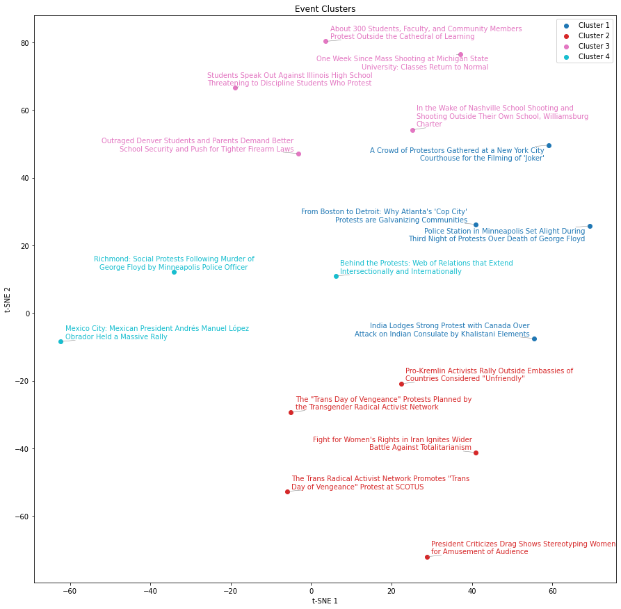
Not entirely convinced by the clustering results, but at least it's an interesting approach.
My starting question was if there are alternative ways to assemble protest events based on the similarity of their descriptions. Although the results are not terribly convincing, I tend to think that it’s mostly due to a few shortcuts taken throughout that exploratory process:
The article descriptions are being truncated because of OpenAI api limits.
The summary of protest events is generated by a poorly designed prompt.
Each protest event summary is also quite brief as I limit them to 100 characters.
My similarity matrix and clustering parameters are tuned to default results. They would probably gain from more involved tuning to optimize results.
All that said, I think there are interesting takeaways from this that could be productized in the project’s data platform. I’m tempted to run an experiment to have a movement grouping process that uses similarity matrices or clustering and compare the result with what I currently have.
Thoughts on how I could better accomplish this? Let me hear your suggestions.